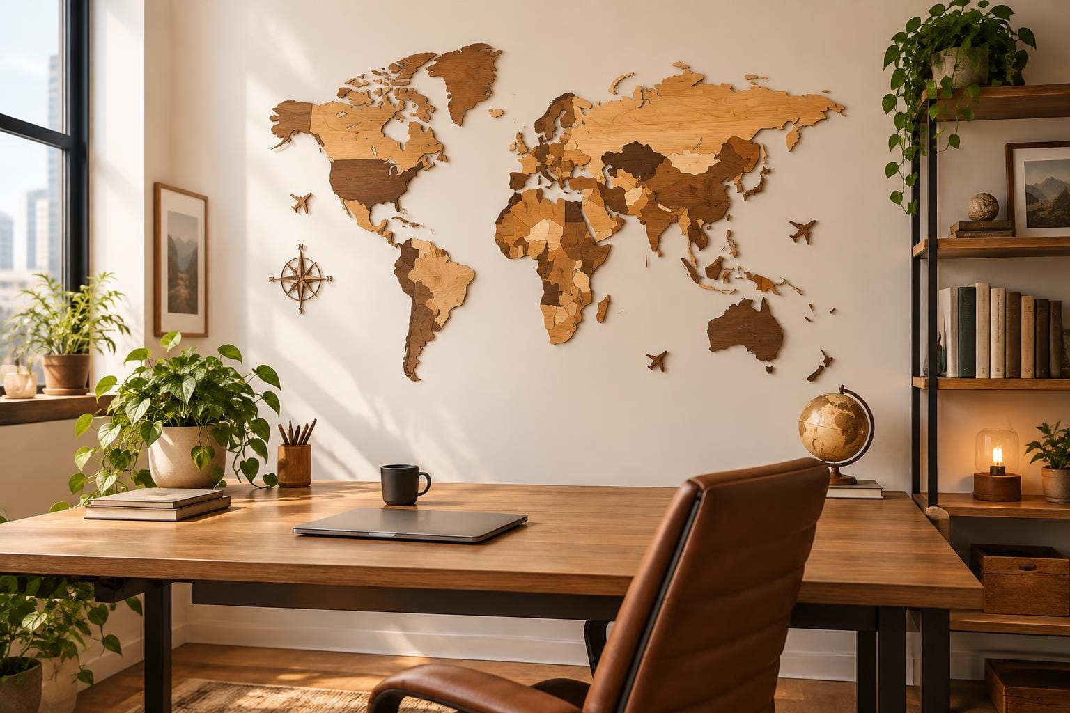
Kotitoimisto on muuttunut. Se ei ole enää pelkkä työhuone, vaan oma tila, joka auttaa keskittymään, innostaa luovuuteen ja heijastaa persoonaamme. Vietämme siellä yhä enemmän aikaa, joten ammattimaisen ilmeen ja kodikkuuden yhdistäminen on entistä tärkeämpää. Yksi tapa on tehdä tehosteseinä, jonka keskipisteenä on puinen maailmankartta kotitoimiston sisustuksessa. Se yhdistää matkailun ilon harkittuun muotoiluun ja tekee tavallisesta seinästä unelmiesi ja seikkailujesi kuvastimen.
Puinen kartta voi olla näyttävä seinän katseenvangitsija missä tahansa huoneessa, mutta kotitoimistossa sillä on erityinen tehtävä. Se antaa katseelle hengähdyspaikan, muistuttaa aiemmista matkoista ja innostaa tuleviin. Tästä oppaasta saat selkeän suunnitelman puisen maailmankartan sovittamiseen työhuoneeseesi. Käsittelemme seuraavat asiat:
- Sopivan paikan ja koon valitseminen kartalle.
- Kartan, hyllyjen ja sisustusesineiden yhdistäminen kokonaisuudeksi.
- Kartan valaiseminen sen yksityiskohtia korostavalla tavalla.
- Ammattimaisen ja mieleenpainuvan taustan luominen videopuheluihin.
Huoneen keskipiste: maailmankartta kotitoimiston seinällä
Tehosteseinän suunnittelu alkaa kartan paikan valinnasta. Toimiva paikka on huoneen pääseinä suoraan työpöydän takana. Näin tilaan syntyy heti selkeä katseenvangitsija. Pöydän ääressä istuessasi kartta toimii inspiroivana taustana, ja huoneeseen saapuva huomaa sen ensimmäisenä. Harkittu sijoittelu tekee kartasta kotitoimiston seinäsisustuksen keskeisen osan.
Mittaa tila tarkasti ennen kartan valintaa. Mittaa käytettävissä oleva vapaa seinäpinta, älä koko seinän leveyttä. Huomioi valokatkaisimet, pistorasiat ja huonekalut. Kartan ympärille on tärkeää jättää hengitystilaa, jotta se ei näytä ahtaalta tai liian suurelta. Hyvä lähtökohta on vähintään 15–20 cm tyhjää tilaa joka puolelle. Vapaa pinta kehystää kartan luontevasti ja auttaa sitä erottumaan.
Tasapainoiseen ilmeeseen vaikuttavat myös mittasuhteet. Kartan leveyden kannattaa olla sopusoinnussa työpöydän kanssa. Pöytää huomattavasti leveämpi kartta voi saada työpisteen tuntumaan pieneltä, kun taas liian kapea hukkuu seinälle. Harmonisena lähtökohtana kartta voi olla noin kaksi kolmasosaa tai kolme neljäsosaa pöydän leveydestä. Näin kaluste ja seinäkoriste tukevat toisiaan. Kartan koko-oppaamme auttaa valitsemaan esimerkiksi M-, L- ja XL-kokojen välillä. Jos vakiokoko ei sovi tilaasi, voit keskustella myyjän kanssa yksilöllisestä koosta tai väristä, jotta kartta sopii työhuoneeseesi.
Yhtenäinen teema matkailusta inspiroituneeseen kotitoimistoon
Kun kartta on paikoillaan, voit vahvistaa sen vaikutusta rakentamalla sen ympärille yhtenäisen kokonaisuuden. Näin yksittäisestä seinäkoristeesta syntyy osa matkailusta inspiroitunutta kotitoimistoa. Harkitut hyllyt ja sisustusesineet tuovat tilaan syvyyttä, persoonallisuutta ja tarinoita. Tavoitteena on ajan myötä koottu henkilökohtainen kokonaisuus, ei tavarapaljous.
Kokonaisuuteen sopivat hyllyt
Hyllyt kehystävät karttaa ja tarjoavat paikan matkamuistoille. Tässä muutamia toimivia sijoittelutapoja:
- Piilokiinnitteiset hyllyt: asenna yksi tai kaksi hyllyä kartan kummallekin puolelle. Symmetrinen sommittelu kehystää kartan peittämättä sitä. Se luo tasapainoa ja ohjaa katseen kokonaisuuden keskelle.
- Yksi pitkä hylly: jos huonekorkeus riittää, kartan yläpuolelle asennettu pitkä ja matalasyvyinen hylly voi näyttää tyylikkäältä ja modernilta. Ratkaisu toimii parhaiten, kun pystysuuntaista tilaa on niin paljon, ettei hylly ahdista karttaa visuaalisesti.
- Suosi pientä syvyyttä: valitse sijoittelusta riippumatta melko kapeita hyllyjä. Syvät hyllyt työntyvät kauas seinästä, varjostavat karttaa ja kilpailevat huomiosta. Pienten esineiden esillepanoon riittää vähäinen syvyys.
Sisustusesineiden valitseminen
Hyllyille valitsemasi esineet herättävät matkatarinasi eloon. Poimi muutama merkityksellinen esine sen sijaan, että täyttäisit pinnat tavaroilla.
- Matkakirjat: pinoa hyllylle muutama suosikkioppaasi tai valokuvateos paikoista, joissa olet käynyt tai joihin haaveilet matkustavasi.
- Kehystetyt valokuvat: tulosta ja kehystä omia matkakuviasi. Valitse kuvia, jotka palauttavat mieleen mukavia hetkiä ja liittyvät kartalla näkyviin paikkoihin.
- Merkitykselliset matkamuistot: aseta esille muutamia pieniä, harkittuja muistoesineitä. Ne voivat olla veistos, keramiikkaesine tai luonnon löytö, kuten erikoinen simpukankuori tai kivi.
- Viherkasvit: pieni ruukkukasvi, esimerkiksi helppohoitoinen mehikasvi tai riippuva kultaköynnös, tuo kokonaisuuteen eloa, väriä ja luonnollista tekstuuria.
Voit yhdistää sisustusesineet myös itse karttaan. Kartta on matkojesi visuaalinen yhteenveto, ja hyllyjen esineet kertovat tarinan eri luvuista. Vuorovaikutteiseksi yksityiskohdaksi voit merkitä vierailemasi maat nastoilla tai muilla merkeillä. Tarkista ensin, että ne sopivat juuri omaan karttamalliisi: osa tarvikkeista myydään erikseen ja on tarkoitettu tietynlaisille kartoille.
Tunnelman luominen: harkitun valaistuksen merkitys
The right lighting can completely transform your wooden world map, elevating it from a simple decoration into a breathtaking work of art. Good lighting is not just about visibility; it’s about creating mood, highlighting detail, and enhancing the natural beauty of the material. When chosen thoughtfully, your lighting scheme will accentuate the map’s high-quality features and make your entire office feel more polished and inviting.
The maps are handmade from birch plywood, a material known for its beautiful and subtle grain. Proper lighting can bring out this natural wood texture, adding warmth and a sense of organic character to your space. For layered 3D models, which have a thickness ranging from 6-12 mm, lighting is even more crucial. It creates soft shadows between the layers, emphasising the map’s depth and making the continents appear to float off the wall.
General Lighting Options
- Picture Light: For a classic, art-gallery-style approach, mount a sleek picture light directly above the map. This provides focused, downward-facing light that illuminates the map evenly and turns it into a true focal point, much like a prized painting.
- Track Lighting: For more flexibility, consider installing track lighting on the ceiling. Adjustable spotlights allow you to aim the light precisely. You can wash the entire wall in a soft glow or angle the lights to create more dramatic shadows that play up the map’s 3D qualities.
Lighting for a Dual-Purpose Workspace
In a home office, your lighting must serve two purposes: highlighting your decor and creating a functional workspace, especially for video calls. According to video conferencing experts, it is best to have your primary light facing the presenter, not coming from behind you. A strong light source behind you, like a bright, unshielded spotlight on your map, will turn you into a silhouette on camera. Furthermore, ergonomic guidelines for computer workstations recommend you control glare around screens to avoid eye strain.
To solve this, use your decorative lighting strategically. Aim track lights to shine across the face of the map rather than directly out from it. This still illuminates the map beautifully but prevents the light from shining into your camera or reflecting off your computer screen. For a fantastic built-in solution that solves all these issues, consider the LED puinen kartta. This version features integrated backlighting that casts a soft, ambient glow around the map’s perimeter. It creates a stunning halo effect that highlights the map day and night without creating harsh glare, making it a perfect feature for the modern, multifunctional office.
The Modern Workspace: Framing Your Perfect Video Call Background
In the era of remote and hybrid work, your video call background has become an extension of your professional identity. It’s the small window your colleagues, clients, and collaborators have into your world. A thoughtfully styled wooden world map provides a background that is professional, personal, and an excellent conversation starter. It signals a global perspective and a passion for discovery, all while maintaining a clean and sophisticated aesthetic.
To ensure you and your map look your best on camera, a few practical tips on framing can make all the difference. For the most flattering angle, video call guides suggest you should position your webcam at eye level or slightly higher. This avoids unflattering low-angle shots and presents you in a more natural, engaging way. You may need to use a laptop stand or stack a few books under your laptop to achieve this.
Frame yourself in the shot so you appear from the shoulders up, leaving a little bit of space above your head. This is a standard composition that feels balanced and professional. You can then choose how to feature your map.
- Symmetrical Framing: Position yourself directly in the centre of the camera’s view with the map centred perfectly behind you. This creates a formal, balanced, and powerful look.
- Off-Centre Framing: Sit slightly to one side of the frame, following the “rule of thirds.” This allows more of your beautiful map to be visible and creates a more dynamic and visually interesting composition.
Whichever you choose, do a quick check to make sure the map isn’t awkwardly cropped at the edges of the video frame. A half-visible continent or a strange cutoff can be distracting, so adjust your position or camera angle for a clean shot. While a map is far more distinctive than a blank wall, it’s still important to maintain a polished appearance. Best practice guides for video communication often recommend a simple, uncluttered background, like a tidy bookshelf or a plant. A wooden map fits this principle perfectly. It acts as a single, elegant focal point rather than a busy or distracting scene. Just be sure to keep any surrounding shelves neat and tidy to complete the professional look.
Tying It All Together with Colour Coordination
The final step in creating your perfect travel inspired home office is ensuring your map’s colour complements your room’s overall design scheme. A harmonious colour palette is what ties the entire space together, creating a look that feels intentional, sophisticated, and complete. The right map colour can either blend seamlessly with your existing decor or act as a bold, contrasting statement piece.
Fortunately, the maps come in multiple colour options, allowing you to find the perfect match for your personal style. Colour availability can vary by map model, so be sure to check the specific product page. Here is some styling advice to help you choose the best finish for your office palette:
- For a Minimalist or Scandinavian Office: If your office features light woods, white furniture, and a clean, airy aesthetic, a Valkoinen tai Valo map is an ideal choice. These options blend beautifully with the uncluttered principles of Scandinavian design, adding texture and interest without overwhelming the space.
- For a Modern or Industrial Space: A Harmaa tai Musta map offers a cool, contemporary look that is perfect for modern or industrial interiors. These colours provide a sleek, graphic element that pairs well with materials like metal, concrete, glass, and monochromatic colour schemes.
- For a Traditional or Classic Office: If your office has a more traditional feel with classic wood furniture, leather accents, and warm tones, the richer finishes are an excellent fit. A Palisander tai Dark Walnut map brings a sense of warmth, depth, and timeless elegance that coordinates beautifully with this established style.
- For an Eclectic or Bohemian Room: For those who love personality, bold choices, and a mix of styles, the Monivärinen map is an expressive and vibrant centrepiece. It adds a playful and artistic touch, becoming a focal point in a room filled with colour, unique objects, and personal flair.
When making your selection, remember that you are choosing a piece made from a natural material. Because the maps are crafted from birch plywood, the actual grain and tone may vary slightly from what is shown in photos. This is not a flaw; it is the signature of a genuine wood product. These subtle variations ensure that your map is a truly unique, one-of-a-kind piece of art, with a character all its own.
Conclusion
Creating an inspiring and functional home office is a rewarding project, and a wooden world map is the perfect centrepiece for it. By following a clear plan, you can design a workspace that is not only productive but also a beautiful reflection of your personal story.
To recap the key steps for styling your wooden world map office decor:
- Position with Purpose: Choose the right wall and scale for your map, typically behind your desk, ensuring it is proportional to your furniture and has visual breathing room.
- Build a Cohesive Theme: Enhance your map with complementary floating shelves and curated accessories like travel photos, books, and plants to tell your story.
- Illuminate Intelligently: Use smart lighting, such as a picture light, track lighting, or a built-in LED option, to highlight the map’s texture and create the right mood for both work and video calls.
- Frame for the Camera: Position your webcam and yourself to frame the map as a sophisticated, uncluttered, and engaging background for your virtual meetings.
With these elements in place, your home office will transform into a space you truly love to be in. We invite you to explore the collection and start envisioning the inspiring and worldly workspace you can create. As a final important reminder, always check the specific instructions included with your chosen map. Our mounting guide offers general tips, but following the model-specific directions will ensure a perfect, secure fit for your wall.